A website without conversions is just an expensive online business card.
Entrepreneurs spend dollars on traffic, ads, SEO… Then visitors come to their site and immediately leave without purchasing. The traffic isn’t typically the problem. The issue is after they get there.
Here’s the truth:
Intelligent design attracts browsers and transforms them into buyers. Often the deciding factor between a successful site and one that fails to convert is just a few design elements.
Let’s break it down.
Here’s what’s inside:
- Why Smart Design Beats Pretty Design
- The Conversion-Boosting Elements Every Site Needs
- Common Design Mistakes That Kill Sales
- How To Build Trust Through Layout
Why Smart Design Beats Pretty Design
A lot of business owners get this wrong.
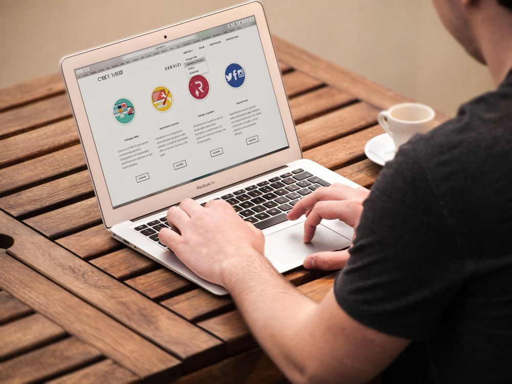
They want a beautiful website… but pretty doesn’t sell. Functional design is different. It directs users to a single goal. Whether it’s completing a form, booking a call or clicking “buy now” – every detail of the page is aligned to that action.
Professional WordPress design leverages the psychology that visitors make snap decisions. It looks good (fast), knows what it wants to say, and makes it clear where to go next. There’s nothing to guess about.
When running a UK business, working with a team like this WordPress Design Agency that specializes in WordPress web design means the layout, branding and structure all encourage visitors to take the actions that expand the business. It’s not about packing a site full of rocket boosters – it’s about eliminating every excuse a visitor has to click away.
The result?
More leads, more sales, and a site that actually earns its keep.
The Conversion-Boosting Elements Every Site Needs
Want to know what separates high-converting sites from the rest?
Not the colour scheme. Not even the logo. It’s the growth-driving components engineered into the design.
Here are the must-haves:
- A clear value proposition above the fold
- One primary call-to-action per page
- Fast load times under 3 seconds
- Mobile-responsive layouts
- Trust signals like reviews and case studies
Each of these elements removes friction. And less friction means more conversions.
Clear Value Proposition
What visitors see first should explain what the business does and why they should care. Not a hero image of a mountain. Not an abstract word.
A strong value proposition tells the visitor:
- What is being offered
- Who it’s for
- Why it matters
That’s it. Keep it simple, keep it punchy.
One Primary Call-To-Action
The problem with most websites is they have too many CTAs. “Sign up here!” “Download this!” “Book a call!” “Read the blog!”
When everything is important, nothing is.
Intelligent design surfaces one core action per page and makes it impossible to miss. Larger buttons. Brighter colours. Conscious placement.
Optimised Checkout Or Form Flow
This is where most sites lose money.
Lengthy forms, confusing steps, and irrelevant fields deter visitors when they’re ready to buy. Research shows that optimizing checkout design can result in a 35.26% increase in conversion for major e-commerce businesses. That’s huge ROI for just some minor changes.
The fix?
Delete any unnecessary form fields. Display progress bars. Enable guest checkout. Make it absurdly easy for visitors to do the thing.
Common Design Mistakes That Kill Sales
Now to the stuff that ruins conversions…
Professionally designed sites can turn away customers over poor design decisions. Avoid these mistakes and watch conversions skyrocket overnight.
Slow Page Speeds
Speed is everything.
Seconds lost are conversions destroyed. People want fast, and they’ll leave if they don’t get it. Slow page loads equal high bounce rates.
Think about it from a user’s perspective.
If a website takes longer than 6 seconds to display useful content, visitors will be gone and researching a competitor on Google. They won’t wait around. They have no patience. They will click away. Typical culprits are:
- Oversized images
- Bloated plugins
- Cheap hosting
- Unused code
Fixing these is usually a quick win. And the payoff is huge.
Confusing Navigation
If someone visits a site and can’t find what they are looking for in 5 seconds, they will exit. Fact.
Good navigation uses standard labels. “About”. “Services”. “Contact”. Not clever wordplay that nobody understands.
Weak Mobile Experience
Mobile now accounts for over 60% of traffic on the internet. If a site looks broken or unresponsive on mobile devices visitors won’t convert.
Responsive designs actually have a 11% higher conversion rate than their non-responsive counterparts. Mobile first is how smart design begins. Secondly think desktop version.
How To Build Trust Through Layout
Trust is the silent conversion killer.
Customers might absolutely adore a product or service… But if a site has “trust wrinkles,” they won’t purchase. Here’s how to create trust through design.
It comes down to these elements:
- Real photos of the team or products
- Testimonials with names and faces
- Visible contact information
- Security badges and certifications
- Consistent branding across every page
All of these communicate to the visitor that the business is legitimate, well-established, and safe to spend money with.
Here’s a tip most people miss…
White space is more important than most people realise. Squashed designs look cheap and tacky. Lots of white space creates an aura of luxury. This makes a site look premium and professional. The perceived quality immediately increases trust.
And don’t underestimate the power of consistency.
Uniformity. Each page should feel like it’s part of the same brand. Same fonts. Same colours. Same voice. When a site “feels” scattered, visitors become suspicious – even if they can’t put their finger on why. A smooth, cohesive design silently assures visitors that this is a professional company they can buy from.
Final Thoughts
Converting site visitors into paying customers is not chance. It’s intentional design decisions that lead people to act.
To quickly recap:
- Smart design beats pretty design every time
- A clear value proposition wins the first impression
- One main call-to-action per page drives results
- Fast load times stop visitors from bouncing
- Trust-building layouts close more sales
Professional WordPress design encompasses all of these experiences into one. Everything else done in marketing hinges on this.
The good news?
This advice applies to any business. Whether building a site from the ground up or tweaking an existing property, intelligent design will return the investment tenfold. Focus on the low hanging fruit – speed, simplicity, and one powerful call-to-action – and conversions will come.