
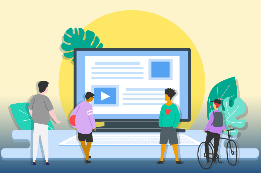
- Many websites look impressive but fail to generate leads or sales because they lack a conversion strategy
- Poor navigation, slow load times, and weak messaging are common reasons visitors leave before engaging
- Continuous testing and performance analysis help identify and fix conversion roadblocks
- The strongest websites combine visual appeal with strategy, ensuring design works hand in hand with results
A polished website can feel like a badge of honour. You’ve invested in the right colours, fonts, and layouts, and everything looks sharp on the surface. The problem is that when the enquiries don’t come in and the sales dashboard stays quiet, it’s easy to feel stuck. A design-first approach often creates a site that impresses visitors at a glance but doesn’t guide them toward taking action. The gap between looking good and actually performing is where many businesses encounter trouble.
The trap of relying on looks alone
It’s natural to think that visual appeal guarantees success online. After all, your website is often the first impression a customer has of your business. The challenge is that visitors rarely stay just to admire aesthetics. They arrive with a purpose, whether it’s to find a service, compare options, or make a purchase. If the website doesn’t help them achieve that goal quickly, the design alone won’t keep them from leaving.
This is where the disconnect starts to show. A sleek homepage might win compliments, but if it doesn’t clearly explain what you offer or guide people to the next step, it misses its purpose. Businesses often invest heavily in the look of their site without considering how well it serves the visitor’s intent. Over time, the frustration grows because the website feels like a trophy piece instead of a working tool that generates leads or revenue.
Why design isn’t the same as strategy
Design is important, but strategy gives it direction. Without a strategy, even the most attractive site is little more than decoration. Strategy determines how information is structured, where calls-to-action are placed, and how the customer journey progresses from the initial click to the final decision.
Think about navigation for a moment. A stylish menu with clever animations might look impressive, but if visitors can’t find what they’re looking for within a few seconds, they’re gone. The same applies to messaging. A homepage filled with sleek visuals but lacking a clear value statement leaves people guessing about what the business actually does. Strategy ensures that design choices aren’t just pretty—they’re purposeful.
When these elements work together, the website feels intuitive and inviting, encouraging visitors to stay, read, and act. That’s when design stops being surface-level decoration and becomes part of a performance-driven system.
Common conversion roadblocks hiding in plain sight
It’s often the small details that quietly drain a website’s potential. Visitors may arrive ready to learn more, yet a confusing layout or an unclear message can send them elsewhere within seconds. Navigation is a common culprit. If menus are cluttered or the pathway to important pages isn’t obvious, users lose patience quickly. Even something as simple as a missing call-to-action button on a key page can break the flow of an otherwise strong design.
Another silent killer of conversions is speed. A slow-loading page leaves visitors with little incentive to wait, regardless of how attractive the visuals may be. The same applies to the heavy use of stock photography. Generic images create a sense of detachment, making it harder for people to trust the business behind the site. And when trust is lacking, conversions fall flat.
Content also plays a huge role. If the messaging is too vague or focuses too much on the company rather than the customer’s needs, visitors don’t see the value. They leave before taking the next step, often without giving the website a second thought.
How professionals address the gaps
The websites that convert well are rarely accidents. They’re the result of careful analysis, ongoing testing, and a willingness to adjust what isn’t working. This process often begins with examining data—such as bounce rates, click paths, and time on page—to pinpoint exactly where visitors are dropping off. From there, changes can be tested in real time, from adjusting button placement to rewriting headlines.
Many businesses turn to digital marketers in Australia to take this work further. These professionals bring not only technical know-how but also an outside perspective. They can identify patterns the business owner may overlook, such as why a particular service page isn’t performing or why traffic isn’t converting into leads. Their approach is rarely about redesigning the site from scratch. Instead, it’s about making incremental improvements that build up to measurable results.
By treating the website as a living asset rather than a one-time project, professionals help ensure that design and strategy stay aligned. The goal is simple: a site that looks good and works hard at the same time.
Turning design into measurable performance
A high-performing website strikes a balance between beauty and function. Strong visuals set the tone, but it’s the combination of clear messaging, data-driven adjustments, and an understanding of customer behaviour that brings lasting results. Instead of treating the site as a static showcase, think of it as an evolving platform that grows with your business.
The best-performing sites are those that put the visitor’s needs first. Every design choice, every piece of content, and every pathway through the site should make sense to the person using it. When that happens, the site’s look doesn’t just catch the eye—it guides people toward the actions that matter, whether that’s filling out a form, making a purchase, or picking up the phone.
Over time, this approach creates more than a good-looking digital presence. It builds trust, encourages repeat visits, and converts first-time visitors into loyal customers. The difference lies not in how striking the site appears at first glance but in how effectively it helps people take the next step.