We have all been there. You click a link, the page loads, and within three seconds, you’re hitting the back button. Maybe it was cluttered. Maybe it was boring. Or maybe you just couldn’t figure out where to go next. In that tiny window of time, the website failed its one job: to make you care.
When you are building your own site, that three-second window is your biggest hurdle. It doesn’t matter how great your product is or how brilliant your blog posts are if nobody sticks around long enough to see them. You want to create a digital space that feels like a great party, inviting, fun, and so engaging that guests lose track of time.
Designing for engagement isn’t about flashy tricks or overwhelming animations. It is about understanding human behavior. It is about creating a path so intuitive that visitors walk it without thinking. Let’s dive into how you can build a site that grabs attention and refuses to let go.
TL;DR
- First Impressions Matter: Your homepage should clearly communicate your purpose with strong visuals and a concise message to engage visitors immediately.
- Simplify Navigation: Limit top-level menu items to five or six and ensure intuitive pathways for users, maintaining the ‘Three-Click Rule’ for easy access to information.
- Emphasize Visuals: Use engaging images and videos to break up text and enhance user experience, making content more digestible.
- Speed is Crucial: Optimize loading times—sites should load in under 3 seconds to prevent high bounce rates.
- Regularly Update Content: Keep your site lively with fresh content and utilize analytics to understand user behavior and improve engagement.
The Art of the First Impression
Your homepage is your handshake. It needs to be firm, friendly and confident. A common mistake is trying to say everything at once. You don’t meet someone and immediately recite your life story, right? The same goes for creating a website, it’s what reflect on the first impression.
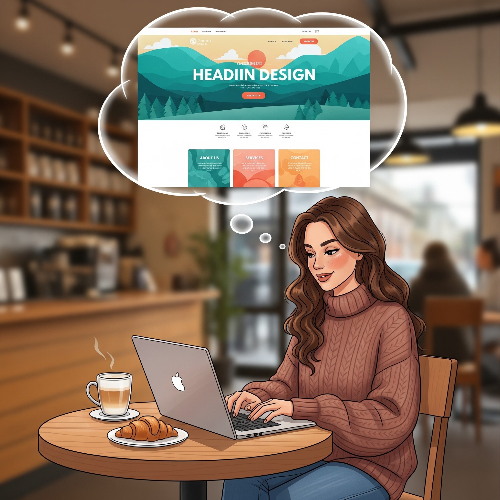
Focus on clarity. When someone lands on your page, they should get who you are and what you do right away. Use a strong headline that speaks directly to their needs. Pair it with a high-quality hero image that sets the mood. This visual hook is crucial. We’re visual creatures, and a blurry photo or a generic stock image signals that you don’t care about the details.
Think about “The Fold”, the part of the screen visible without scrolling. Your most important message needs to live here. But don’t be afraid of the scroll. If your content is compelling, people will naturally want to see more. The goal is to give them a reason to start that journey.
Navigation That Feels Like Second Nature
Imagine walking into a grocery store where the milk is next to the motor oil and the bread is hidden in the back office. You would leave immediately. Your website navigation is the store layout. It needs to make sense instantly.
Keep your menu simple. Limit your top-level items to no more than five or six. Use clear, standard labels. “About” is better than “Our Philosophy.” “Contact” is better than “Let’s Talk.” Creativity is great for your content, but for navigation, clarity wins every time.
Drop-down menus can be helpful, but use them sparingly. Too many layers can feel like a maze. A good rule of thumb is the “Three-Click Rule” a visitor should be able to find any piece of information on your site within three clicks.
Also, don’t forget the footer. It’s the safety net for visitors who scroll to the bottom and haven’t found what they need. Use it for links to your social media, contact info, and less critical pages like your privacy policy.
Visuals That Tell a Story
Text is important, but visuals are what make people feel something. A wall of text is intimidating. It looks like work. Breaking that text up with images, videos, and graphics makes your content digestible and enjoyable.
This is where you can really play. Use photography that reflects your brand’s personality. If you are a fun, quirky brand, use bright colors and candid shots. If you are a high-end luxury brand, use minimalist layouts and elegant, moody photography.
Video backgrounds are great for setting the mood, but watch out for long load times (more on that later). Even small animations, like a hover effect that changes a button’s color or scrolling text that fades in, can add a polished, interactive feel. These “micro-interactions” show users that the site is responsive, encouraging them to explore further. Want to enhance your site? Try adding features like the ability to stream a Video Playlist for a dynamic experience!
Choosing Your Playground: A Platform Comparison
You can have the best design ideas in the world, but if your platform fights you every step of the way, you are going to have a bad time. You need a builder that gives you creative freedom without requiring a degree in computer science.
There are plenty of options out there, but they aren’t all created equal. Here is a look at how some major players stack up when it comes to flexibility and engagement features.
| Feature | Wix | Squarespace | WordPress |
| Design Freedom | High. Drag and drop anything, anywhere. Total creative control. | Medium. Structured templates that look great but can be rigid. | Variable. Depends entirely on your theme and coding knowledge. |
| Ease of Use | Very High. Intuitive interface designed for everyone. | High. Clean interface but slightly steeper learning curve. | Low to Medium. Can be complex to set up and manage. |
| Interactive Elements | Built-in. Easy to add animations, video backgrounds, and scroll effects. | Limited. Good standard features, but less customization. | Plugin-dependent. You often need extra plugins to add cool effects. |
| Maintenance | Zero. Hosting and security are handled for you. | Zero. Fully managed platform. | High. You are responsible for updates, backups, and security. |
Wix shines here because it removes the barrier between your idea and the screen. If you want to move a button five pixels to the left, you just move it. If you want to add a cool parallax scroll effect, it’s a built-in option, not a complex code workaround. That freedom allows you to build those unique, engaging experiences that keep people glued to the screen.
Speed Kills (Bounce Rates, That Is)
We live in an era of instant gratification. If your site takes five seconds to load, you have already lost a huge chunk of your audience. Speed is a feature. It is a fundamental part of the user experience.
Optimize your images. High-resolution photos are great, but they can be massive files. Use tools to compress them without losing quality. Be mindful of how many custom fonts you are using. Each font file adds to the load time.
This is another area where your platform choice matters. Managed web builder platforms like handle a lot of the heavy lifting regarding server speed and caching automatically. If you are on a self-hosted platform, you might need to install caching plugins or upgrade your hosting plan to get the same performance.
Mobile Is Not an Afterthought
More people browse on their phones than on desktop computers. If your site looks great on a laptop but is a jumbled mess on an iPhone, you are ignoring half your audience.
Designing for mobile means more than just shrinking things down. It means rethinking the experience for a touch screen. Buttons need to be big enough to tap with a thumb. Text needs to be legible without zooming. Navigation menus often need to collapse into a “hamburger” icon to save space.
Check your mobile view constantly while you are designing. Does that beautiful hero image still make sense when it’s cropped vertically? Is that long paragraph of text now an endless scroll? Adjusting these elements specifically for mobile users shows respect for their time and experience.
Calls to Action That Actually Get Action
Don’t just get viewers’ attention, get them to take action. It’s not enough for visitors to simply look, they need to act. Whether it’s signing up for a newsletter, purchasing a product, or booking a consultation, a strong Call to Action (CTA) guides them to take the next step. Similarly, if you’re running a YouTube live stream, you can boost viewer engagement by using a poll to encourage participation.
A good CTA stands out and should visually pop from the rest of the page. Use contrasting colors for your buttons and active, exciting language. Instead of “Submit,” try “Get Started” or “Join the Fun.”.
Placement matters too. Don’t hide your CTA at the very bottom of the page; sprinkle them throughout your content. Give people multiple opportunities to say “yes,” but don’t overdo it. If everything is shouting for attention, nothing gets heard.
Keeping the Spark Alive
Launching your site is just the beginning. To keep engagement high, your site needs to feel alive. A “news” section that hasn’t been updated since 2019 makes your business look dormant.
Refresh your content regularly. Add new blog posts, update your portfolio with recent projects, or swap out your hero image seasonally. This gives people a reason to come back. It also signals to search engines that your site is active, which can help more people find you in the first place.
Use analytics to see what’s working. Tools like Google Analytics (or built-in dashboards on platforms like Wix) can show you where people are spending time and where they are dropping off. If everyone leaves from your “About” page, maybe it’s time to rewrite that bio. Data takes the guesswork out of design.
Final Thoughts: Design with Empathy
At the end of the day, designing an engaging website is an exercise in empathy. It’s about putting yourself in the shoes of the person on the other side of the screen. What are they looking for? What frustrates them? What delights them?
When you answer those questions, you stop building a website for yourself and start building it for them. You create a space that is helpful, beautiful, and easy to use. You turn casual visitors into loyal fans. And that is the ultimate goal of great design.
So go ahead. Play with layouts. Experiment with colors. Test out that bold new headline. You have the tools and the vision. Now go build something that makes people want to stay awhile.
FAQ
What is the importance of a strong homepage in website design?
The homepage serves as the initial point of interaction between your brand and your visitors. It needs to clearly communicate your purpose through strong visuals and a concise message to engage users immediately. A well-designed homepage reflects clarity and purpose, creating a good first impression that invites users to explore further.
How can I simplify the navigation on my website?
To simplify website navigation, limit your top-level menu items to five or six and use clear, standard labels for pages. Avoid complex dropdown menus and ensure that users can access any content within three clicks. This intuitive design creates a user-friendly experience, helping visitors find what they need quickly.
Why are visuals important in engaging website design?
Visuals are crucial because they enhance the user experience by breaking up text, making content more digestible and enjoyable. Effective use of engaging images, videos, and graphics can evoke emotions and convey your brand’s personality, encouraging users to remain on the site longer.
How can I ensure my website loads quickly?
To optimize loading times, compress images to reduce file size without losing quality, and limit the use of custom fonts, as each adds to the loading time. Choosing the right web building platform also plays a role; managed platforms often handle speed optimizations automatically, whereas self-hosted sites may require additional plugins or upgraded hosting for better performance.
What strategies can I use to keep my website content fresh?
Regularly update your website by adding new blog posts, showcasing recent projects, or refreshing visual content. This not only keeps your site lively for returning visitors but also signals to search engines that your site is active, potentially improving search visibility. Utilizing analytics can help identify the types of content that engage users the most.